An organized and easy way to follow Tennis Statistics
23'
UX UI Designer
App
Overview
Since the beginning of 2023, Tennis had a growth of more than 20% in both players and fans, and is expected to continue to grow over the next 5 years. However, the apps and official sites have an outdated design and demonstrate usability issues, which can be improved.
Goal
Design a tennis app that provides the user with the facility to view tennis results, find out the latest news and learn more about their favorite players in an intuitive and easy-to-access way.
Problems
One of the main problems for users was navigating the apps, as the content was quite difficult to find. They also prefer to search the results in Google because the Tennis apps do not have enough features and are complicated to use.
Tools
I wanted to understand the problems and needs of my users, so I conducted user interviews and secondary research. After this, I created a user journey that reflected the “as to be” of the product.


Knowing the industry
It was necessary to understand how Tennis and sports apps presented themselves to their users and tried to solve their problems. This was to generate ideas and find gaps in their experiences that could be improved in my product.
Tools
I performed a competitive analysis of the 2 most important Tennis apps on the market. In addition, I added the main Football app. Each was analyzed to find opportunity gaps.
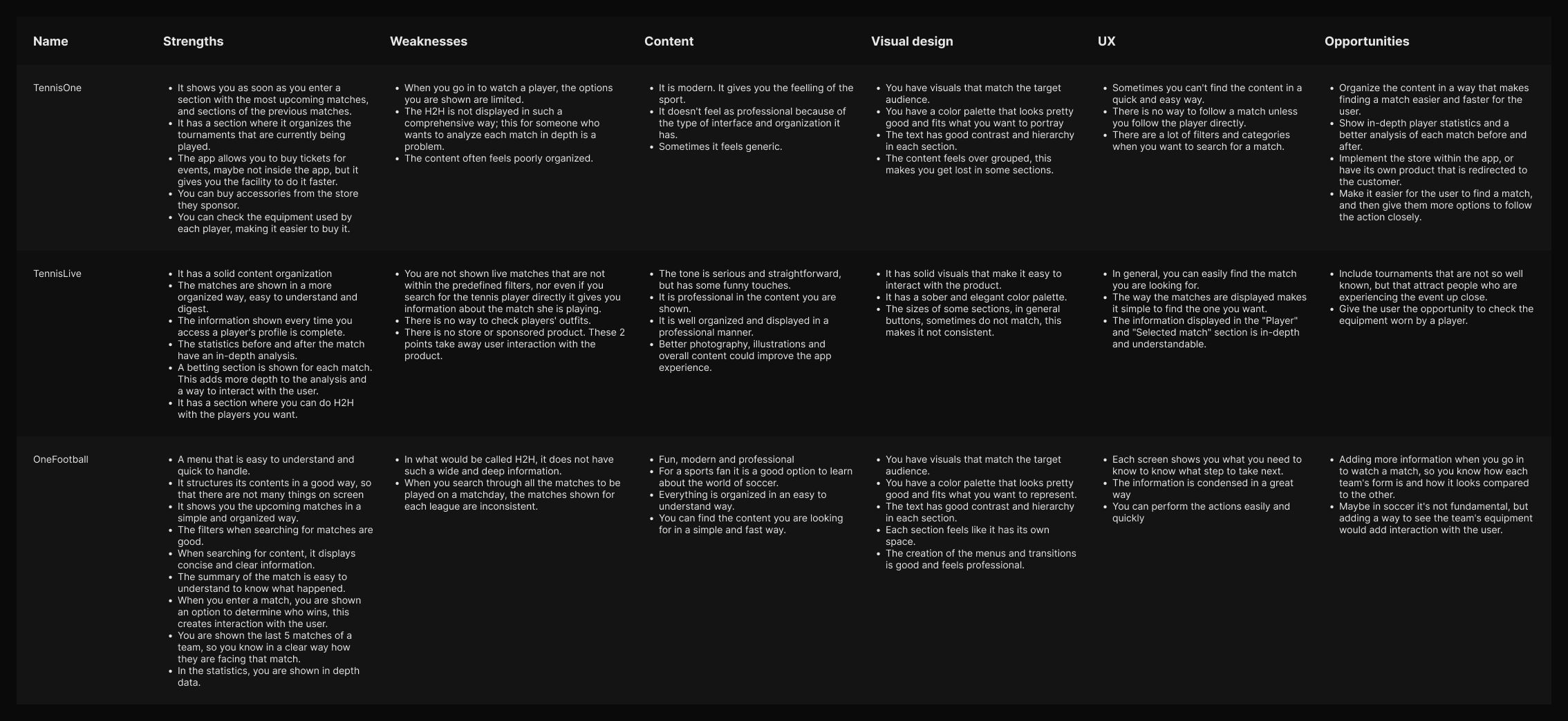
Final insights
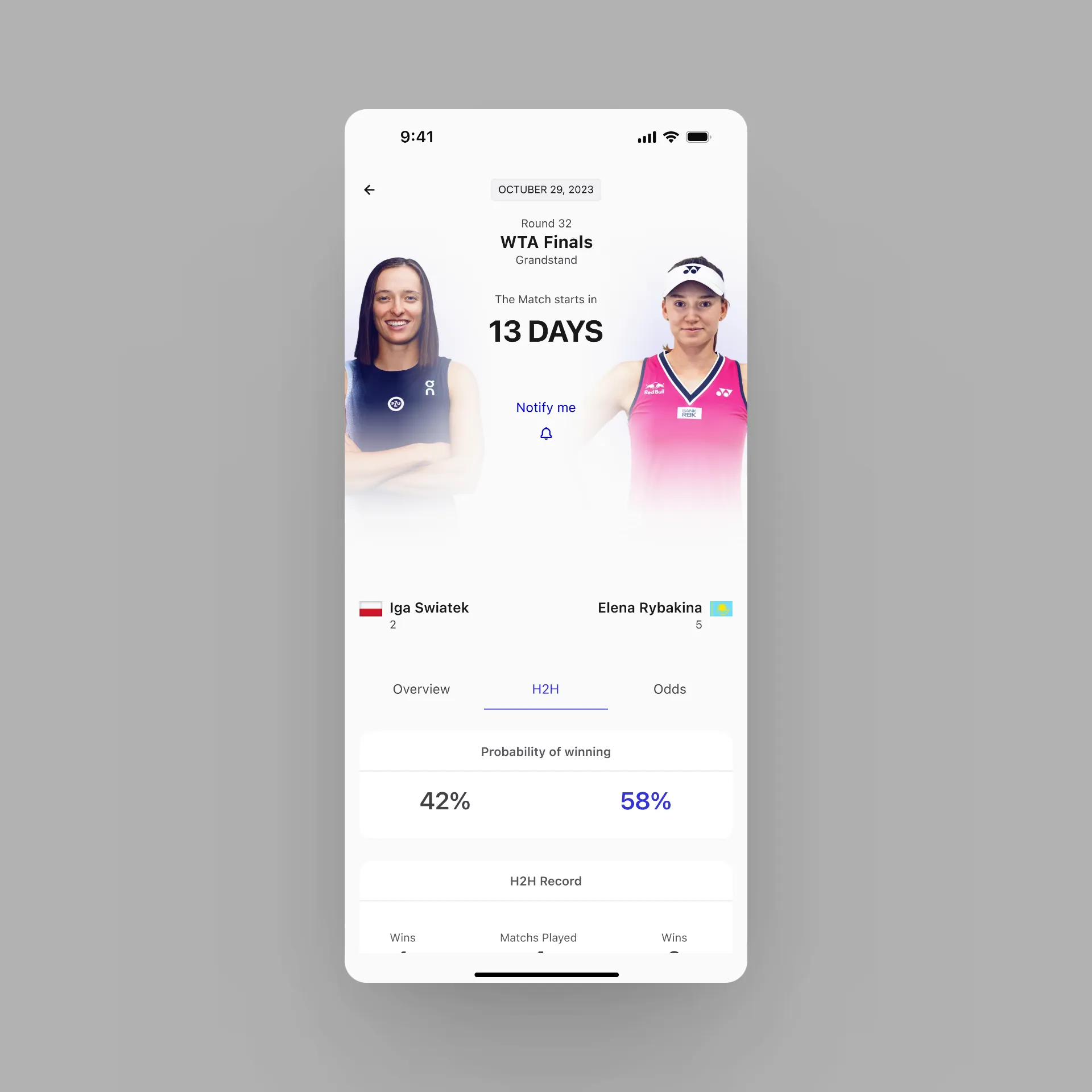
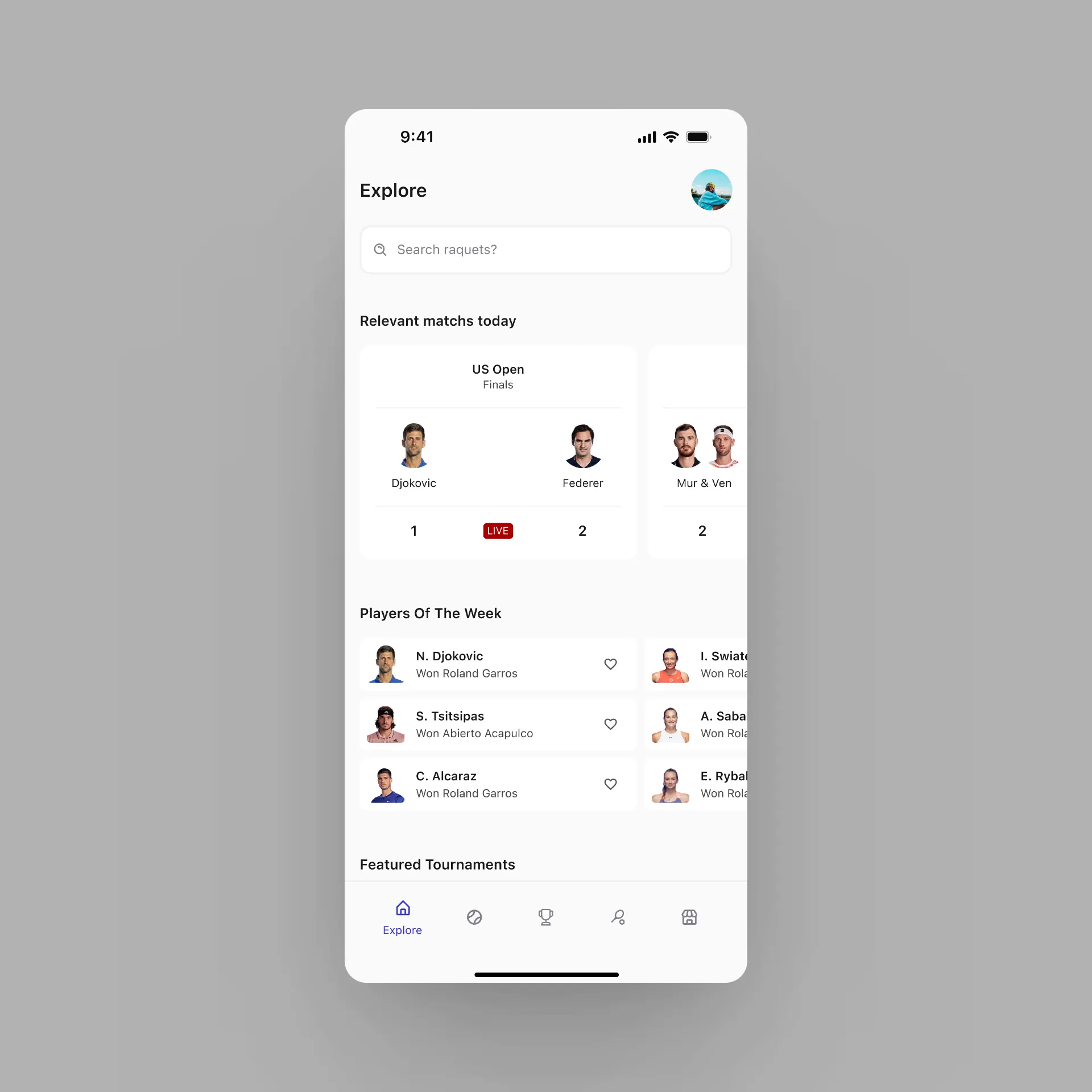
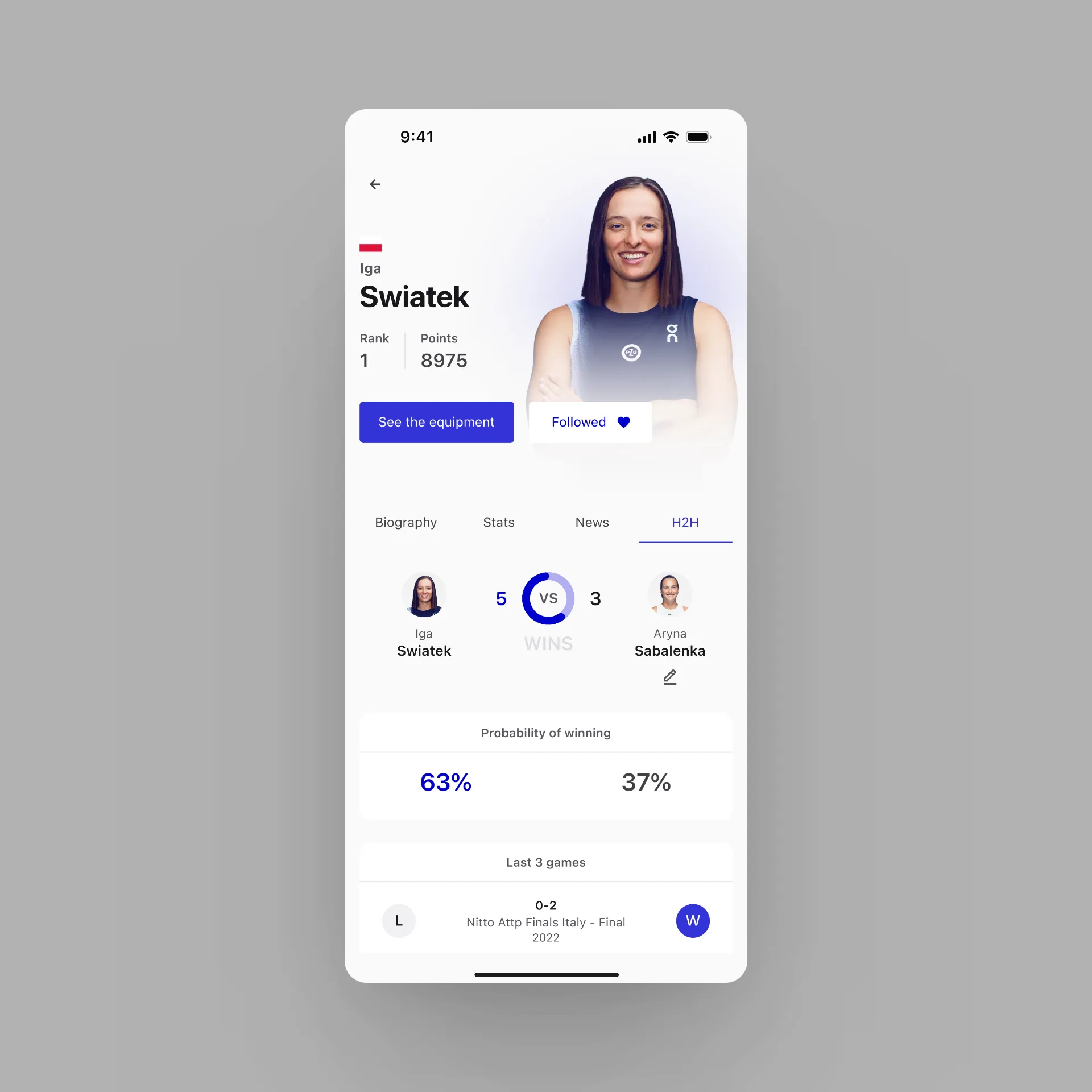
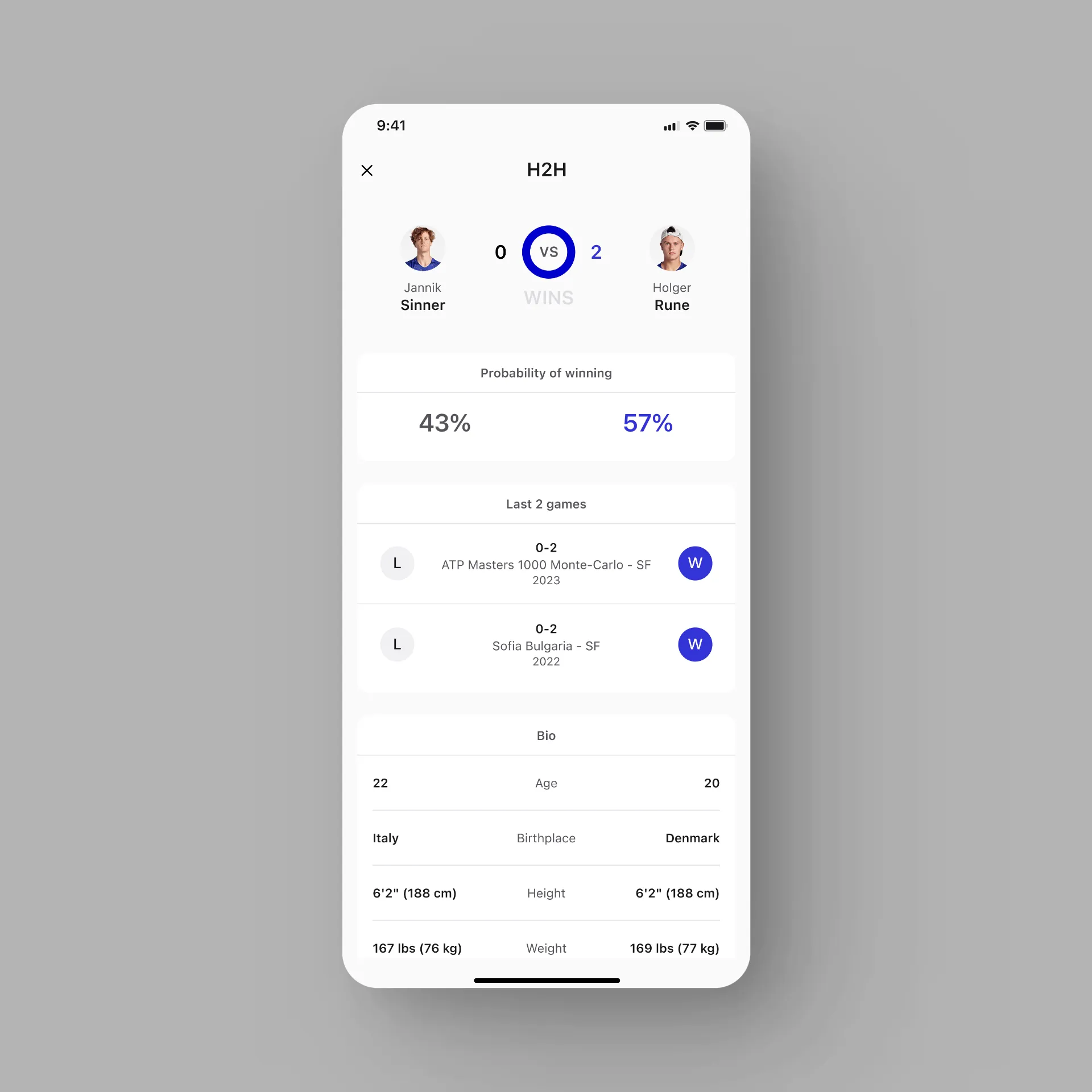
In-depth statistics
Provide in-depth player and match statistics. Due to the interest
of users to see every detail of the match.
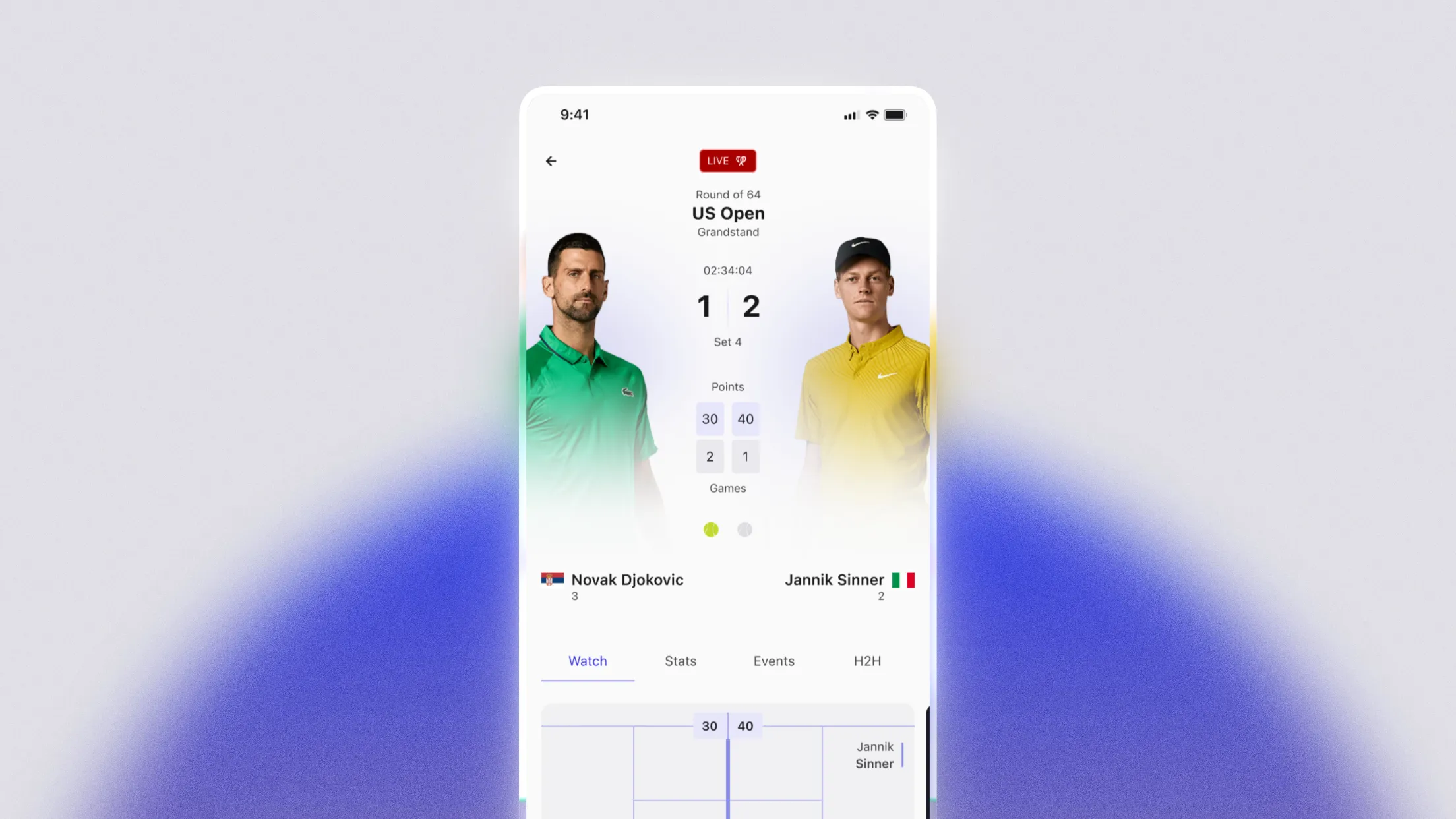
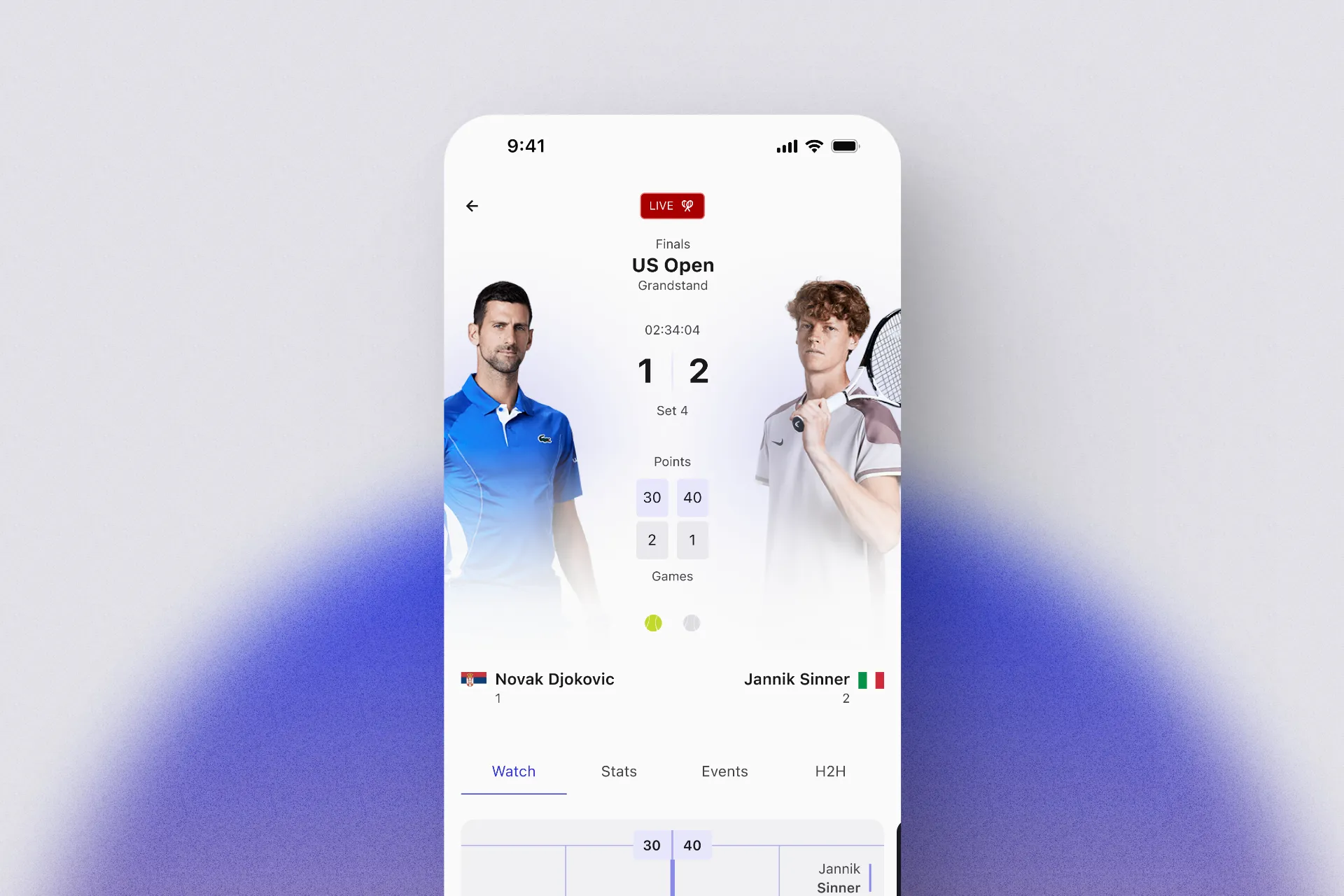
Match feedback
Users want different ways to find out the results and actions of
the match.
Simple organization
Users do not want to browse an infinite number of screens to get
to the element they want to see.
Main challenge
How might we provide information about sport to the user in a way that is easy to understand and access?
Solution
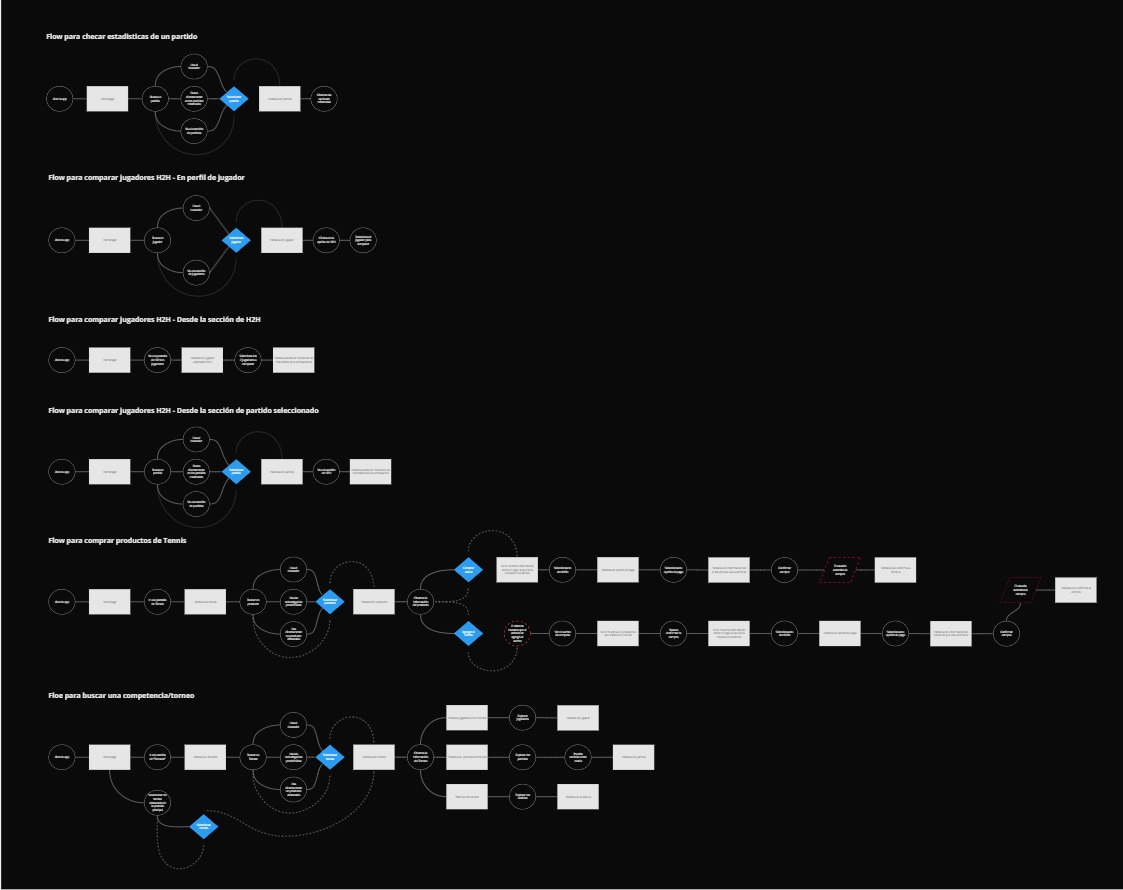
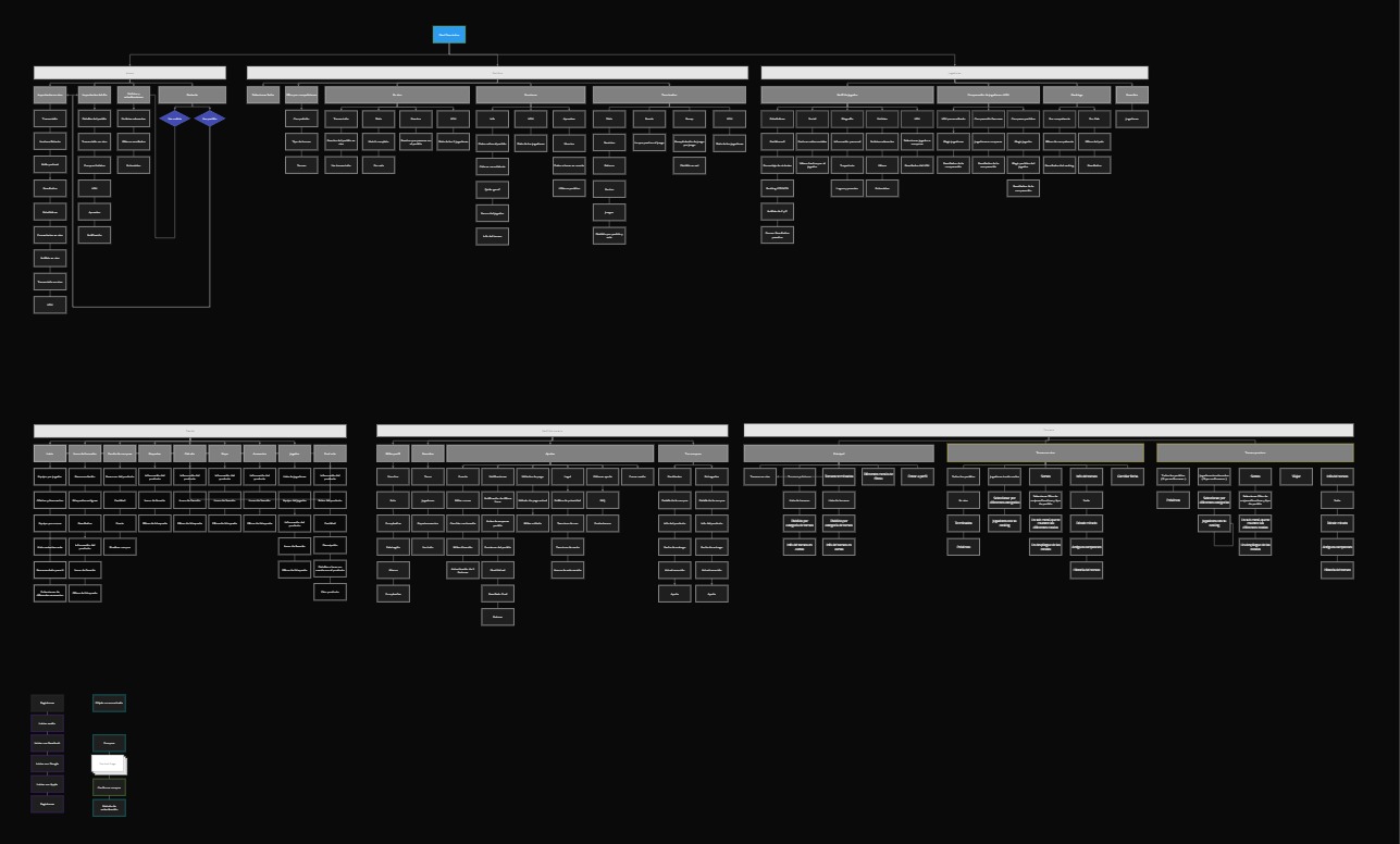
I created a structure that would be easy to understand on each screen. Task Flows and a Sitemap were created to have a broad view of the processes and organization of the product (this link takes you to the file to see them better). It was Miro, so... sorry for the bad quality on the image below ):
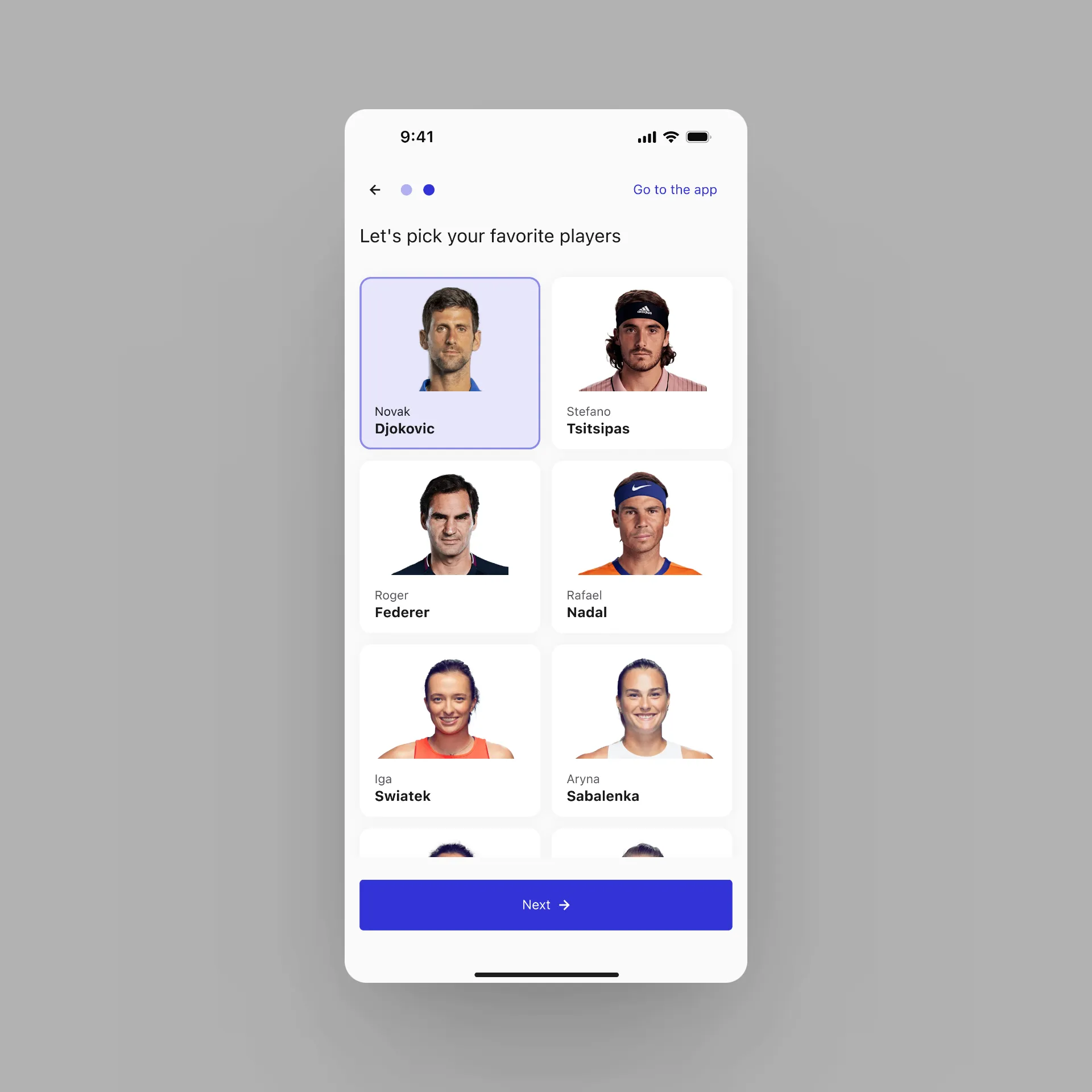
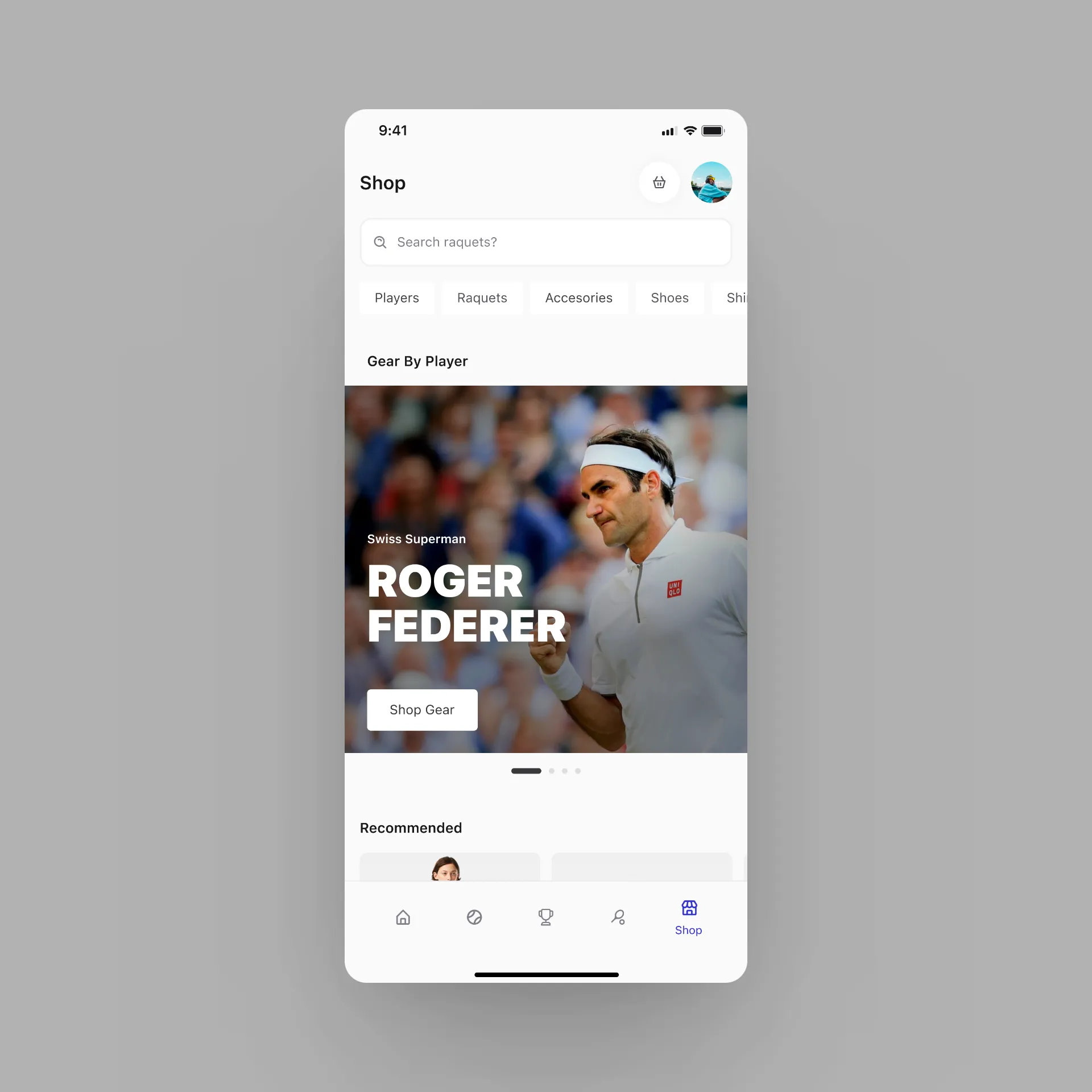
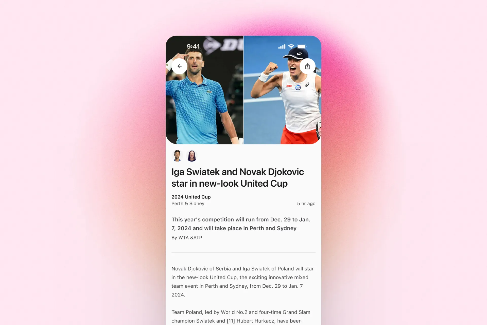
Visual design
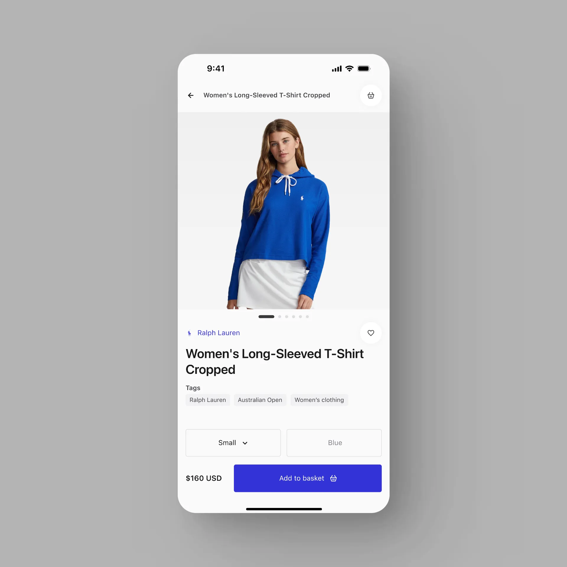
To further solve the previous challenge, I created a clean and
accessible interface that connect with the sport and feel easy to use.
Outcomes
The main tasks of the app were tested with 5 users. They were then
presented with a survey about their opinions of the experience.
80%
Success Rate
40%
NPS
4/5%
Had an intuitive process
80%
CSS