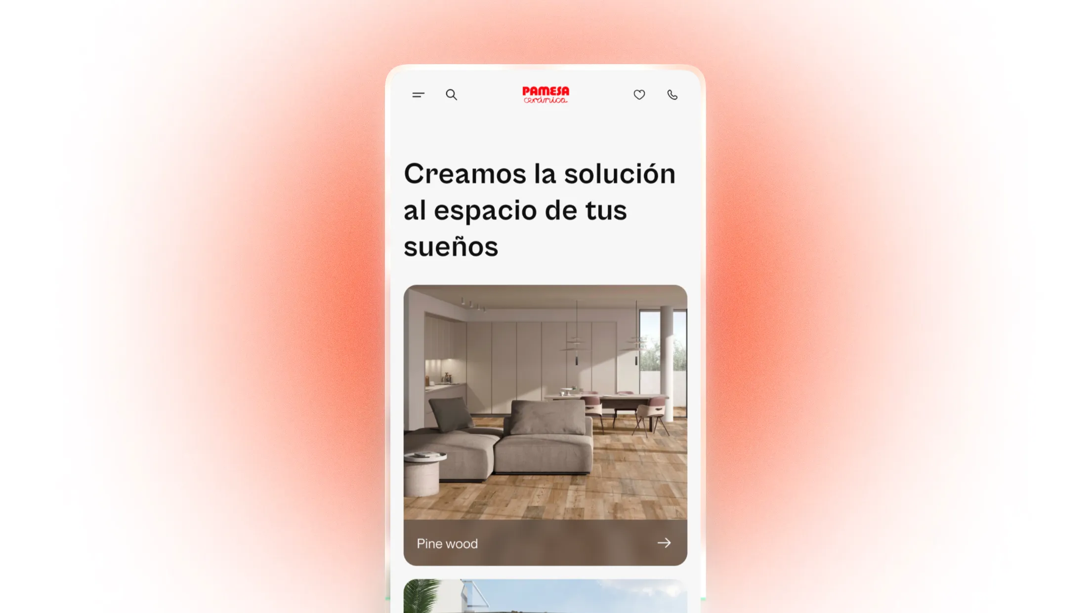
Find inspiration for your personal spaces.
24'
UX UI Designer
Web
Overview
Pamesa is one of the leading distributors of ceramic material in the world, being among the top 5 distributors in 2023. It has several plants around Spain and these have a distinguished, elegant and professional experience when visiting them. However, the overall user experience on their official website is not comparable to visits their plants, with complex (and even broken) navigation, a layout where it takes time to find the information you need, and a visual identity that leaves much to be desired compared to their competitors in the global top 4.
Goal
Design a website that improves the organization of the products, usability and visual identity when looking for interior design inspiration at Pamesa. Improving the overall user experience.
Problems with UX
The current site has broken flows that lead to nowhere and has no clear goal for the user. Depending on which section you're in, the layout can be confusing. In addition, the visual system changes in several sections and is not consistent.
Problems with UI
The visual design leaves much to be desired, being inferior compared to its direct and indirect competitors. This contrasts too much in the personal experience you have when you go to one of their plants.
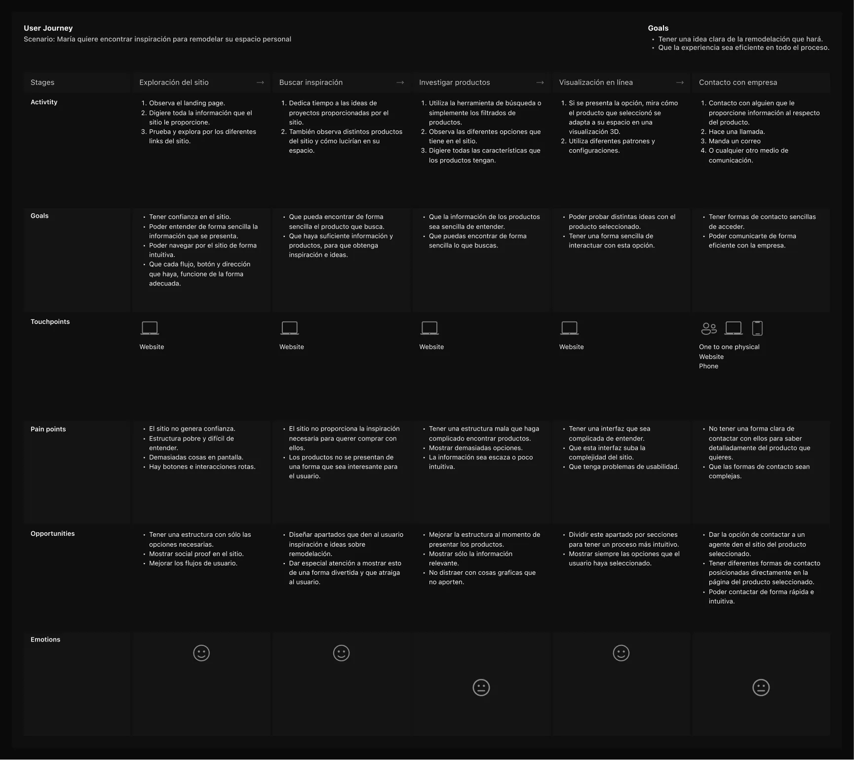
Knowing the industry
To fix the broken flows and improve the experience, I had to understand how the industry works and define a clear goal for the Pamesa site.
Tools
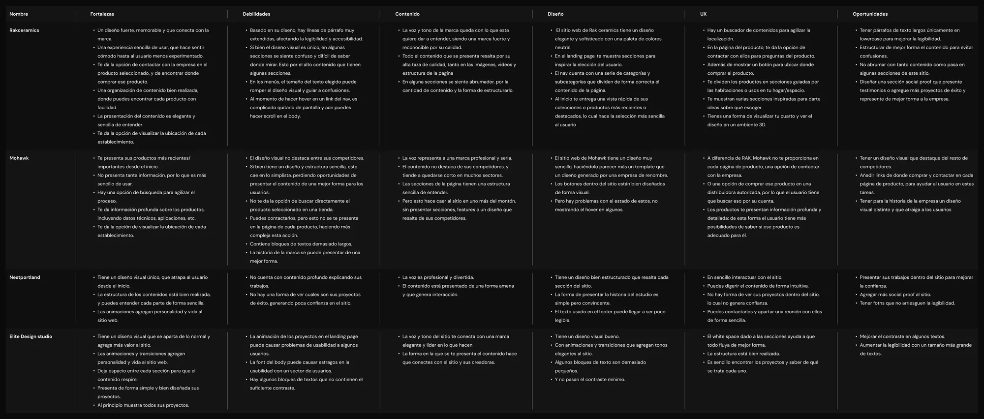
A User Journey was created to map the experience the user would have both inside and outside the site. And a competitive analysis was conducted to understand how other brands solved their problems.
Finding errors
The site redesign needed to find every bug in the system that could compromise the user experience.
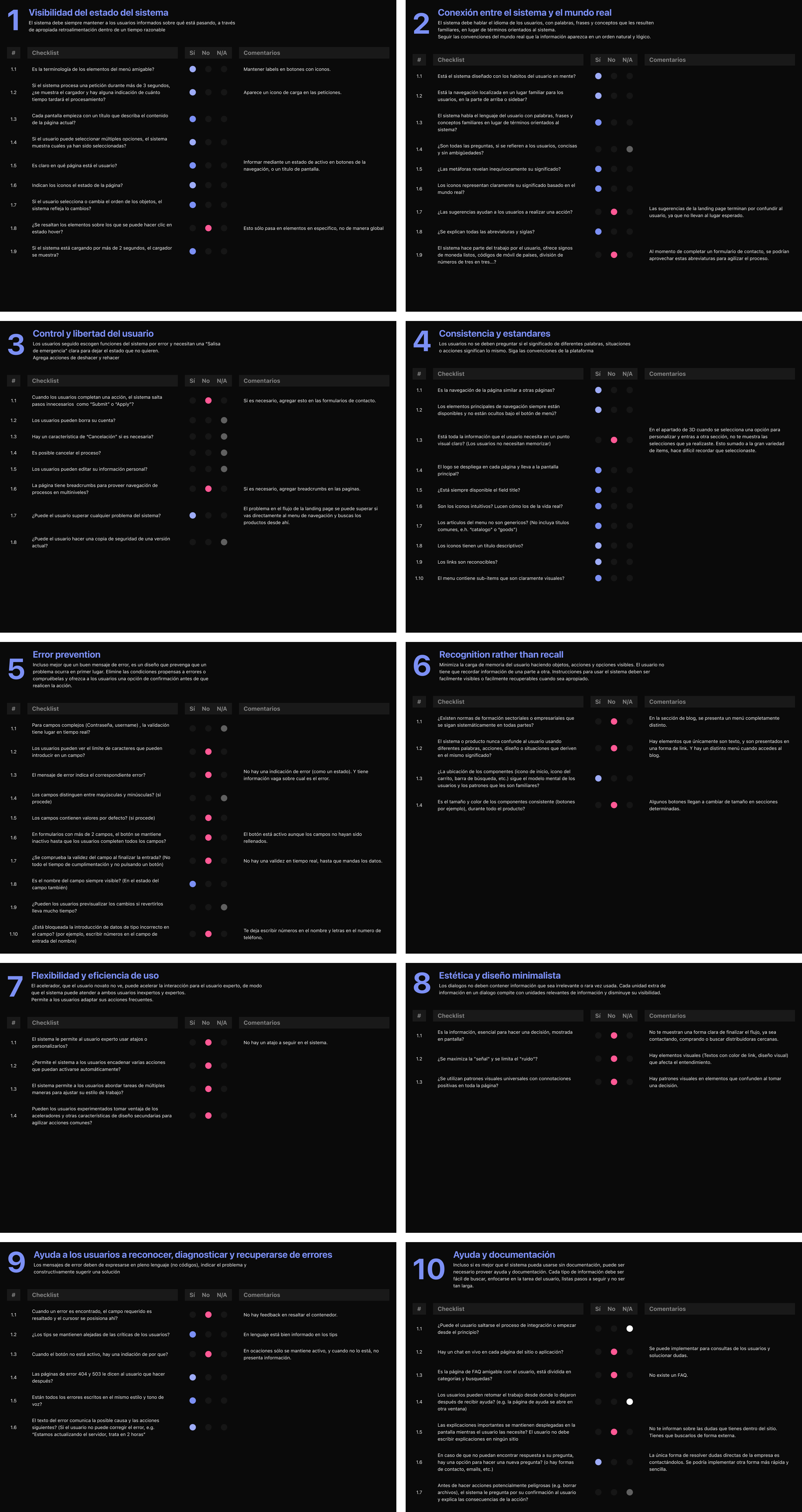
Heuristic Evaluation
That is why I conducted a heuristic evaluation to understand the current system in depth and find problems within it.
Final insights
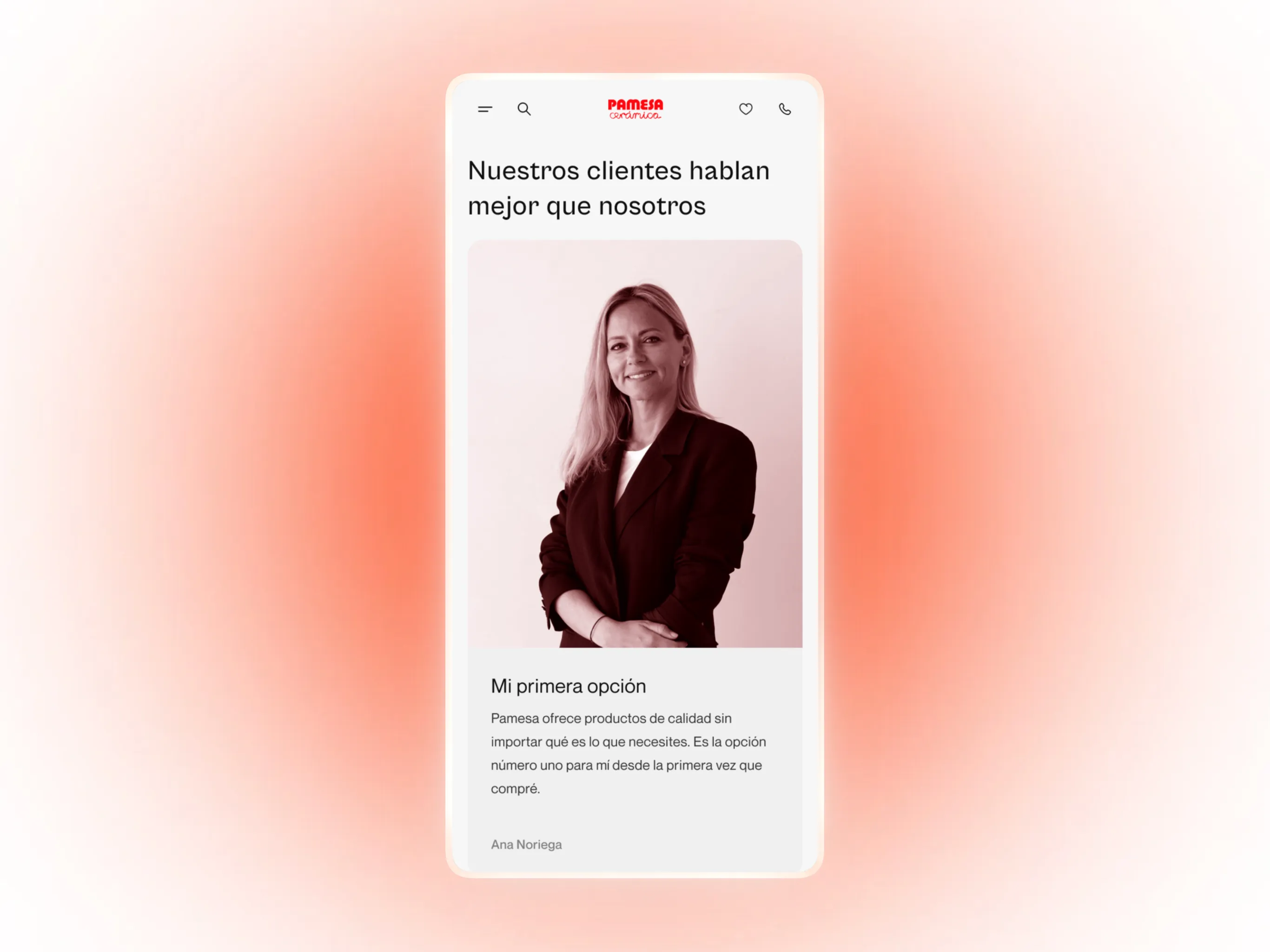
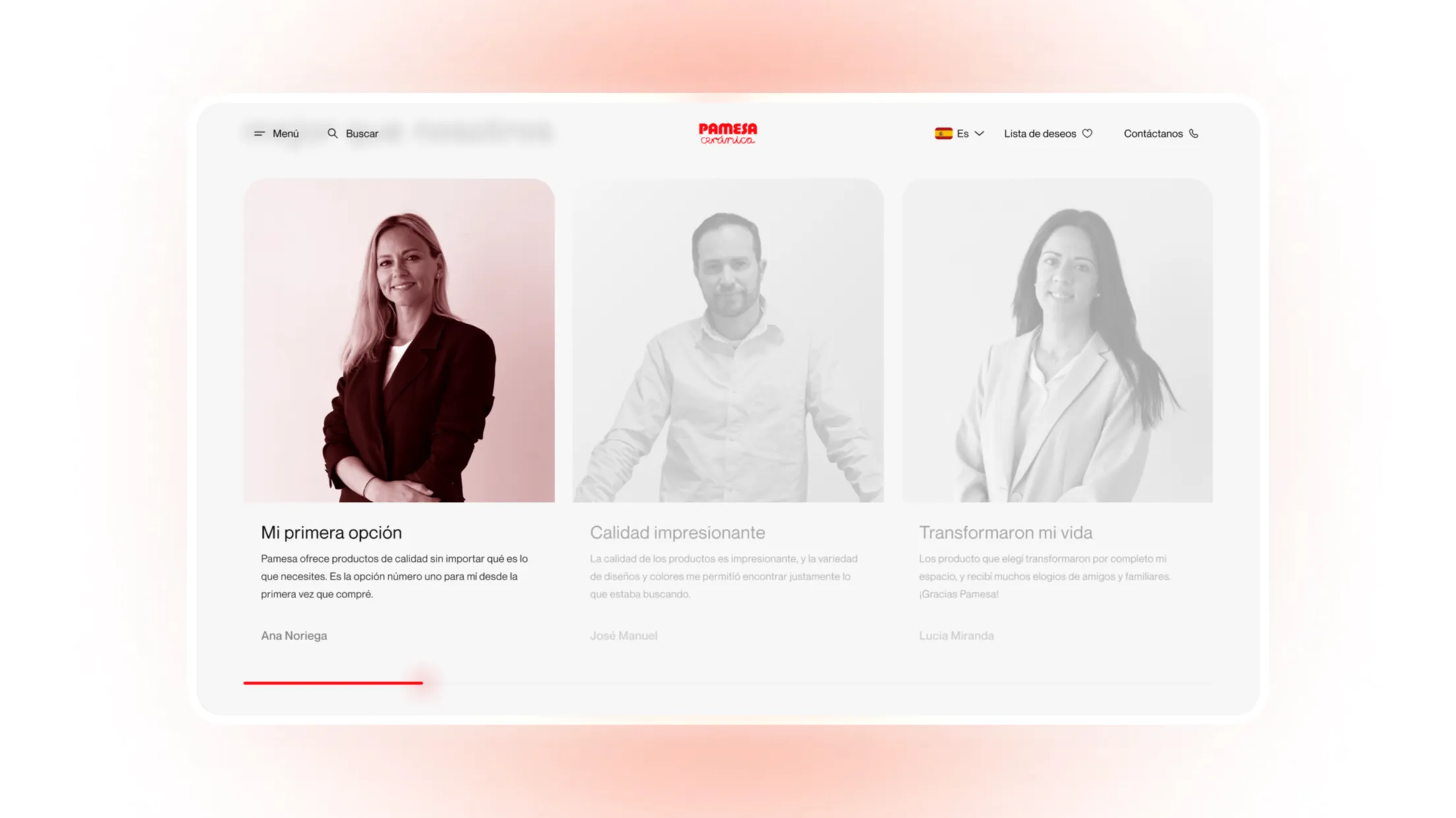
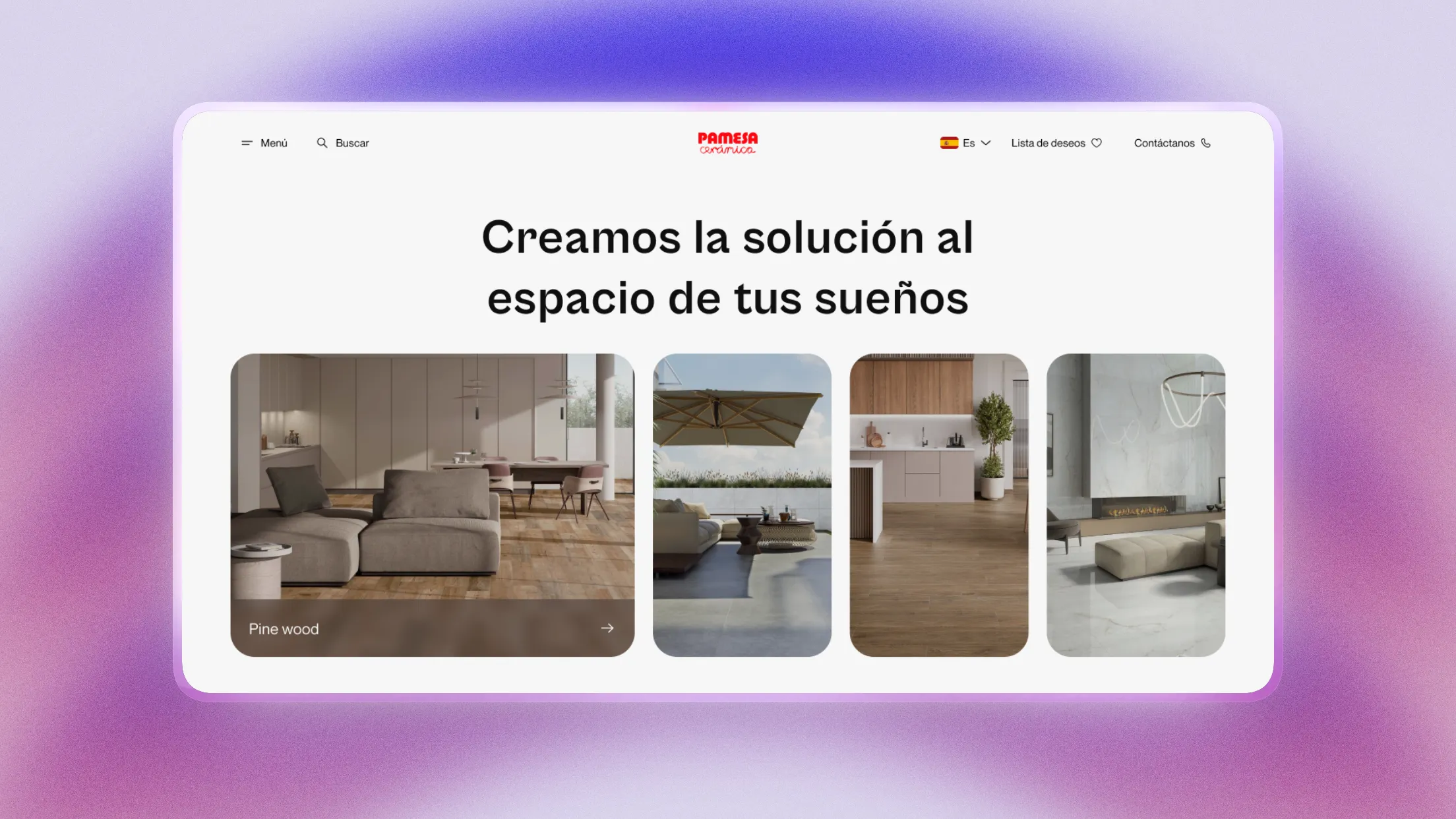
Visual identity
Make the visual design more appealing to users, encouraging them
to explore each collection and helping them find the “inspiration” they're
looking for.
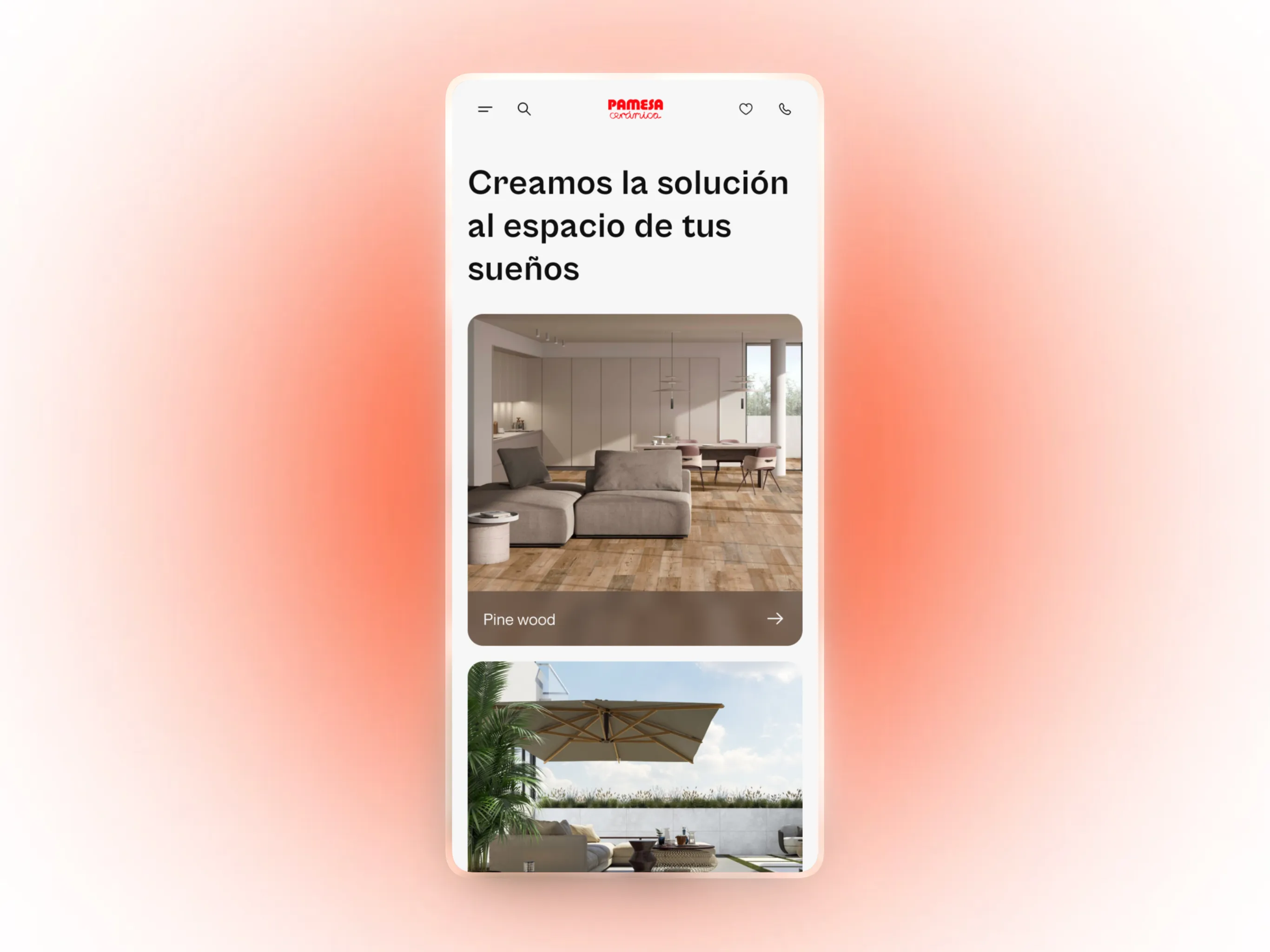
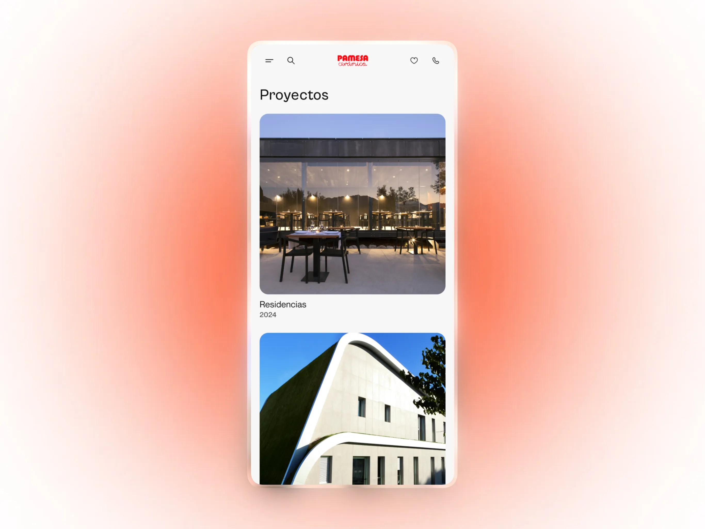
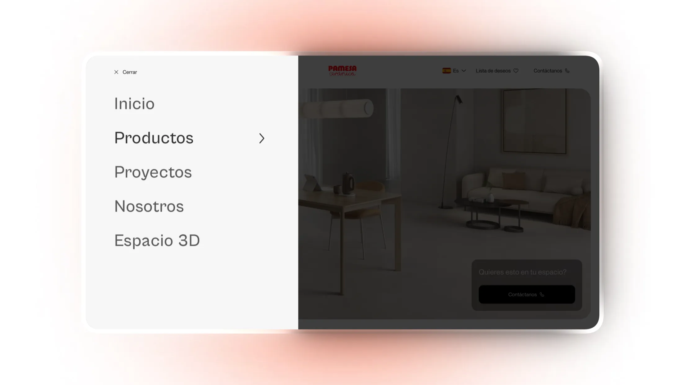
Clear structure
Create a structure that allows users to navigate easily and
quickly, while avoiding overwhelming them with too much information and too many
menus.
Main challenge
People looking for inspiration to remodel their space, encounter usability problems and poorly structured flows. This causes users to abandon the site due to the lack of response to their needs and problems.
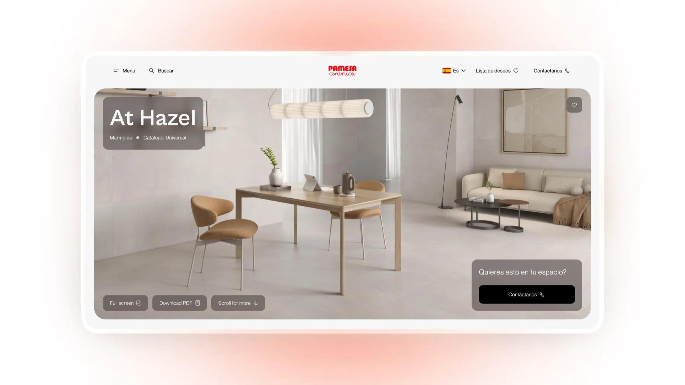
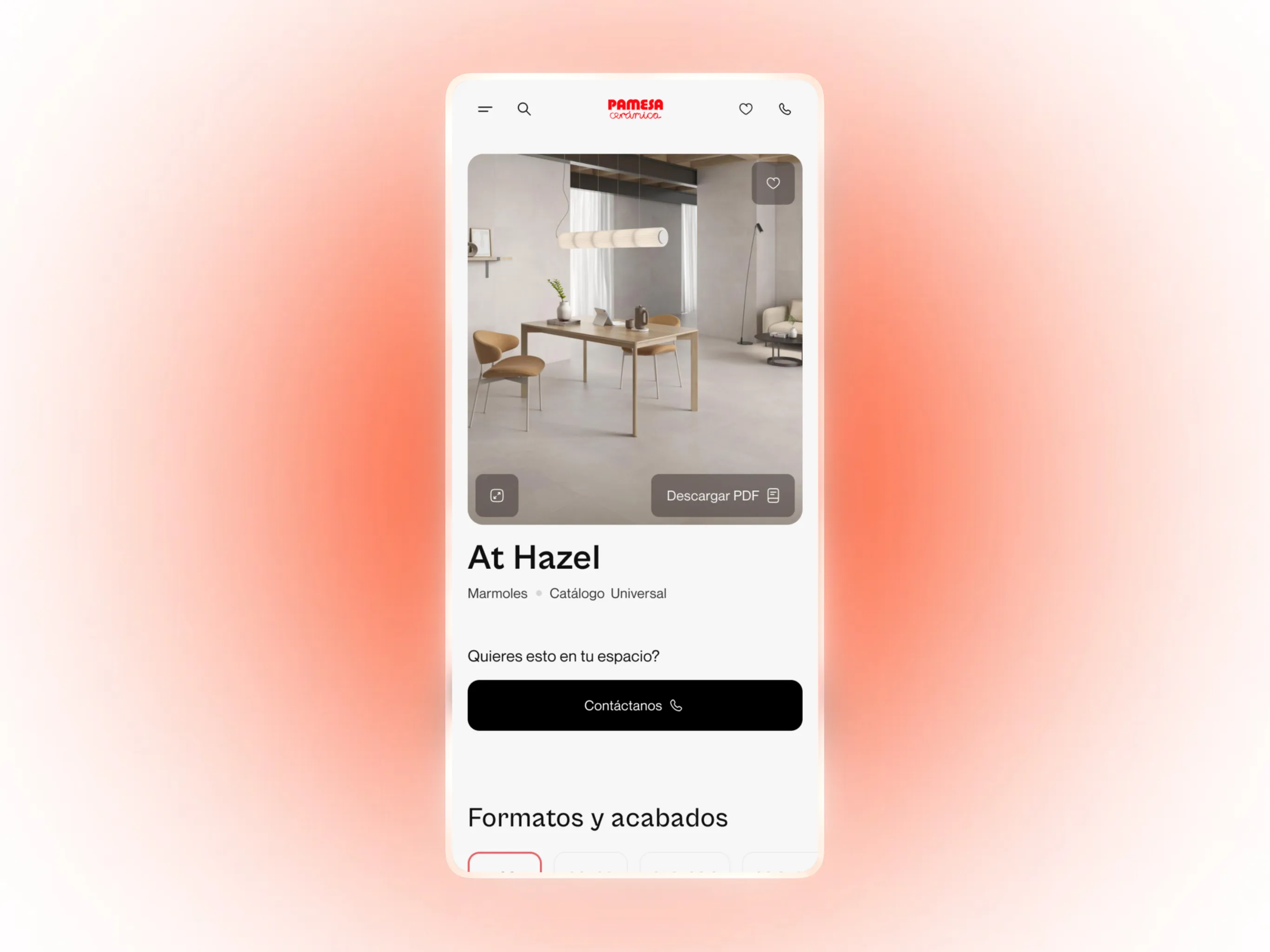
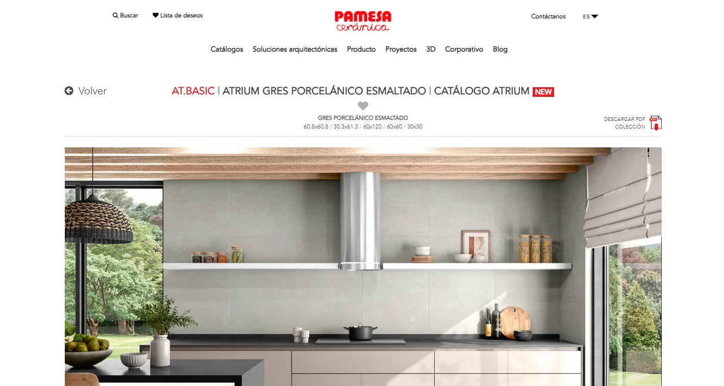
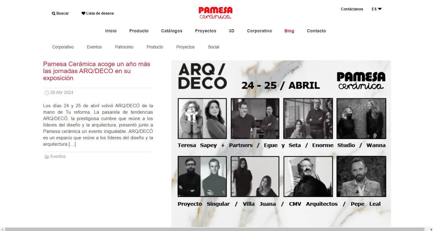
Solution
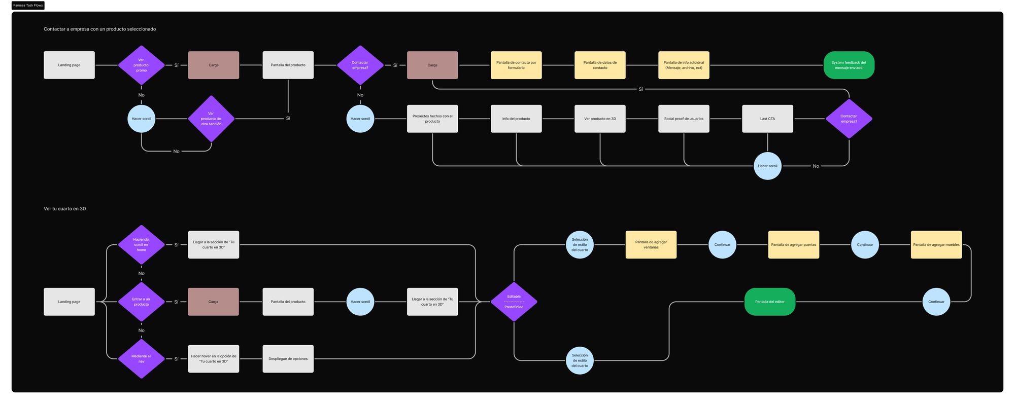
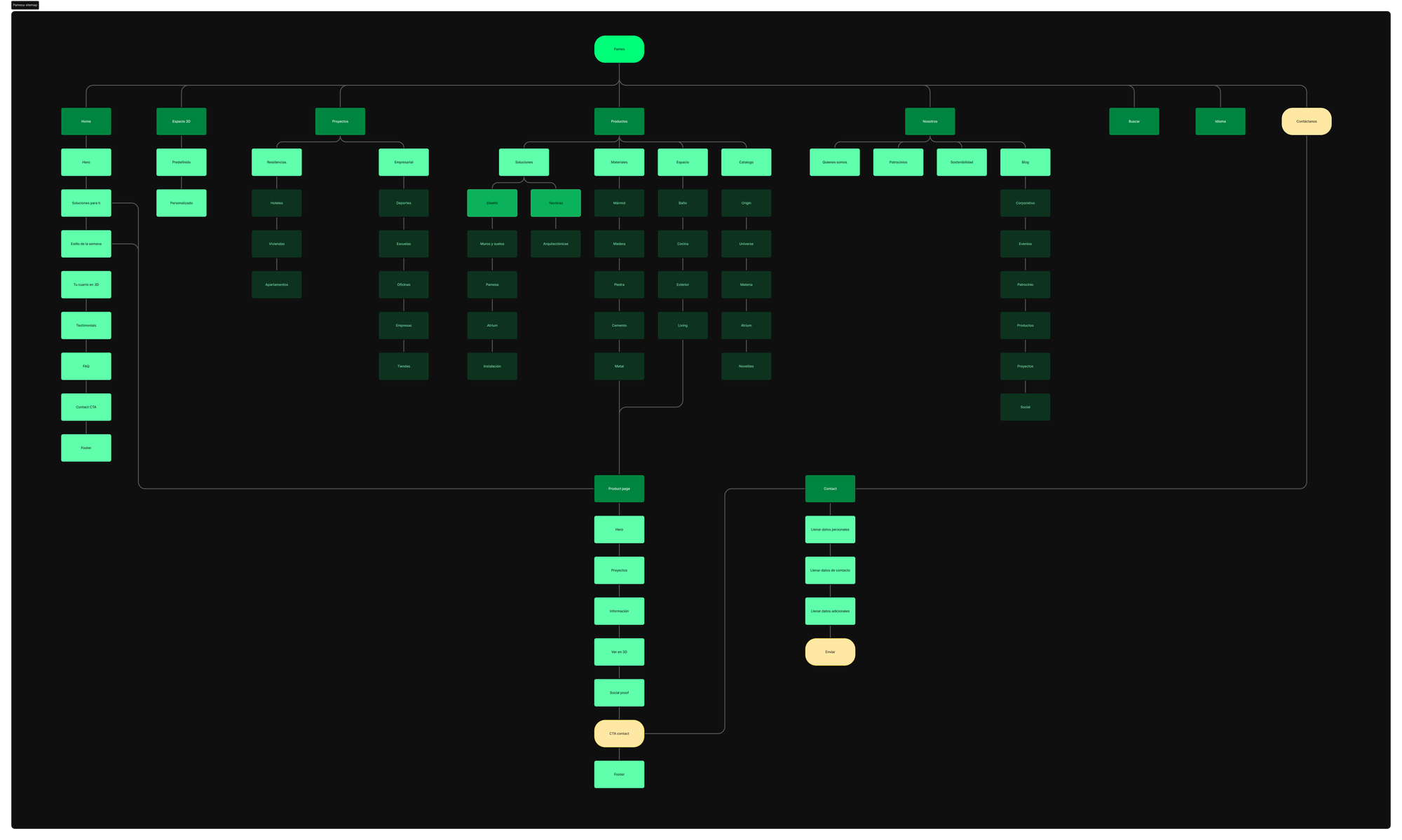
After all the research, I created a structure that was easy to interact with, arranging elements intuitively in the interface.
Visual design
The visual design had to be elegant, but it has to maintain its
functionality and be easy to interact with.